Every few years, a new design trend arises, going on to define the look and feel of that period.
A Design Language for a New Decade
Every few years, a new design trend arises, going on to define the look and feel of that period. Although it’s still early days, a new candidate has recently emerged that may go on to be a staple look for user interface and graphic design as we enter the new decade.
That new design trend is “Neumorphism”.
Neumorphism is a portmanteau of “New Skeuomorphism” and represents a significant shift in the look and feel of everything from website logos to user interface elements.
Neumorphism draws upon the older design principles of Skeuomorphism and blends them with the flatter, material design-based ethos that has been in vogue for the last 7-8 years.
Skeuomorphism: A Brief History.
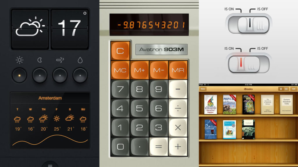
keuomorphism appeared towards the end of the 1980s, and with help from pioneers like Steve Jobs of Apple, went on to define nearly 20 years of early computer user interface (UI) design.
In a nutshell, Skeuomorphism is a style of design that aims to describe elements of a user interface in terms of their real-life equivalents: The “recycle bin” being the best example, closely followed by an icon of a “floppy disk” to represent saving a file.
This design language became popular because it was a handy way to orient and inform new users in the early days of home computing.
Skeuomorphism lived on until the smartphone era and evolved to encompass the entire look and feel of the user interface, rather than simply elements within it.
Apple’s OS X and early iterations of iOS sported buttons with realistic shiny surfaces and a reading app that featured book-like leather bindings and wooden display shelves.
Enter Flat Design:
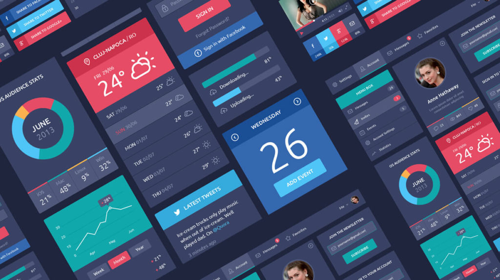
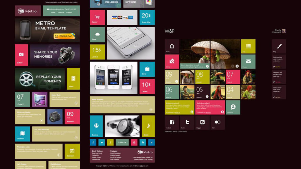
Around 2012, UI and graphic design began to change, embracing a more minimalistic, two-dimensional approach with bright, flat colours. Flat design’s popularity blossomed with the release of Windows 8, Apple’s iOS 7, and Google’s Material Design, all of which utilised flat design elements.
These companies had realised that modern users had grown up using computers and no longer required Skeuomorphism’s visual clues to orient themselves to a system’s user interface.
Flat design also lightened the load for mobile devices, because a website’s content could be scaled smoothly for various screen sizes due to the use of simple flat shapes and lack of textures.
The Downside:
Despite massive popularity, the flat design trend is beginning to receive some pushback from designers.
The user experience of interfaces and websites can suffer when three-dimensional effects like shadows are removed, creating “button blindness” within apps and interfaces.
Combine this with a complete lack of texture, and you have a recipe that can prevent less tech-savvy users from successfully negotiating a user interface.
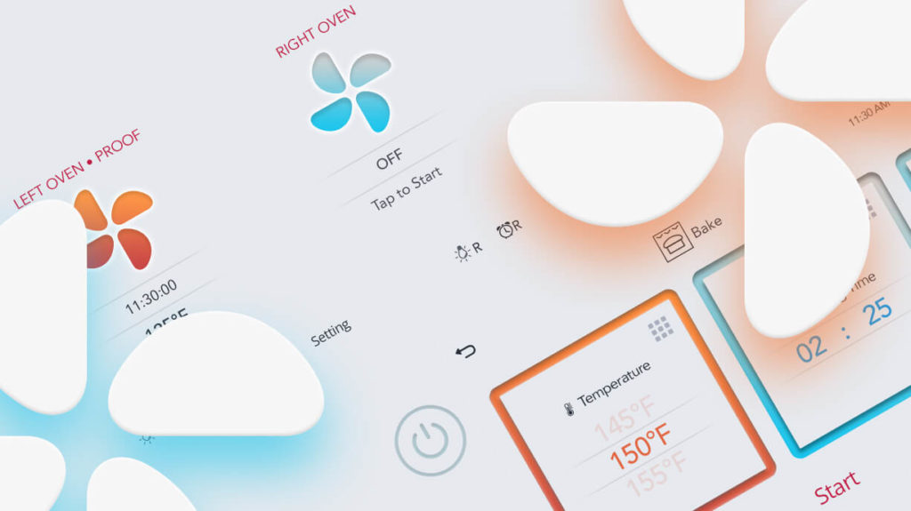
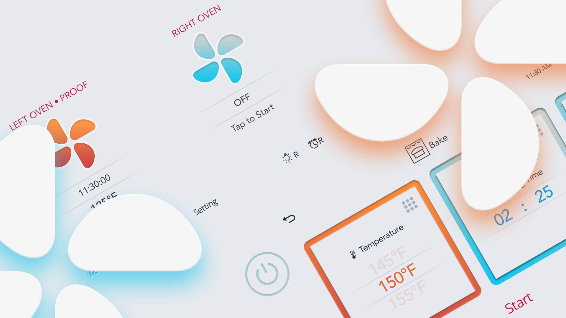
Enter Neumorphism
Neumorphic design is something of a bridge between flat design and earlier Skeuomorphism. It’s a design language that says:
“We like flat design, but we’d like a little of the shading and humanity injected back in”.
That translates to clean modern interfaces, with clickable components featuring dark box- shadows on the bottom and light box-shadows on top. It’s a clever way of making elements appear to push themselves out of the display.
You get your 3D elements back but retain that flat, textureless design.
Only time will tell if this new design trend takes hold. As the new decade unfolds, it certainly seems as though flat design has had its day in the limelight and is due for a much needed revamp.